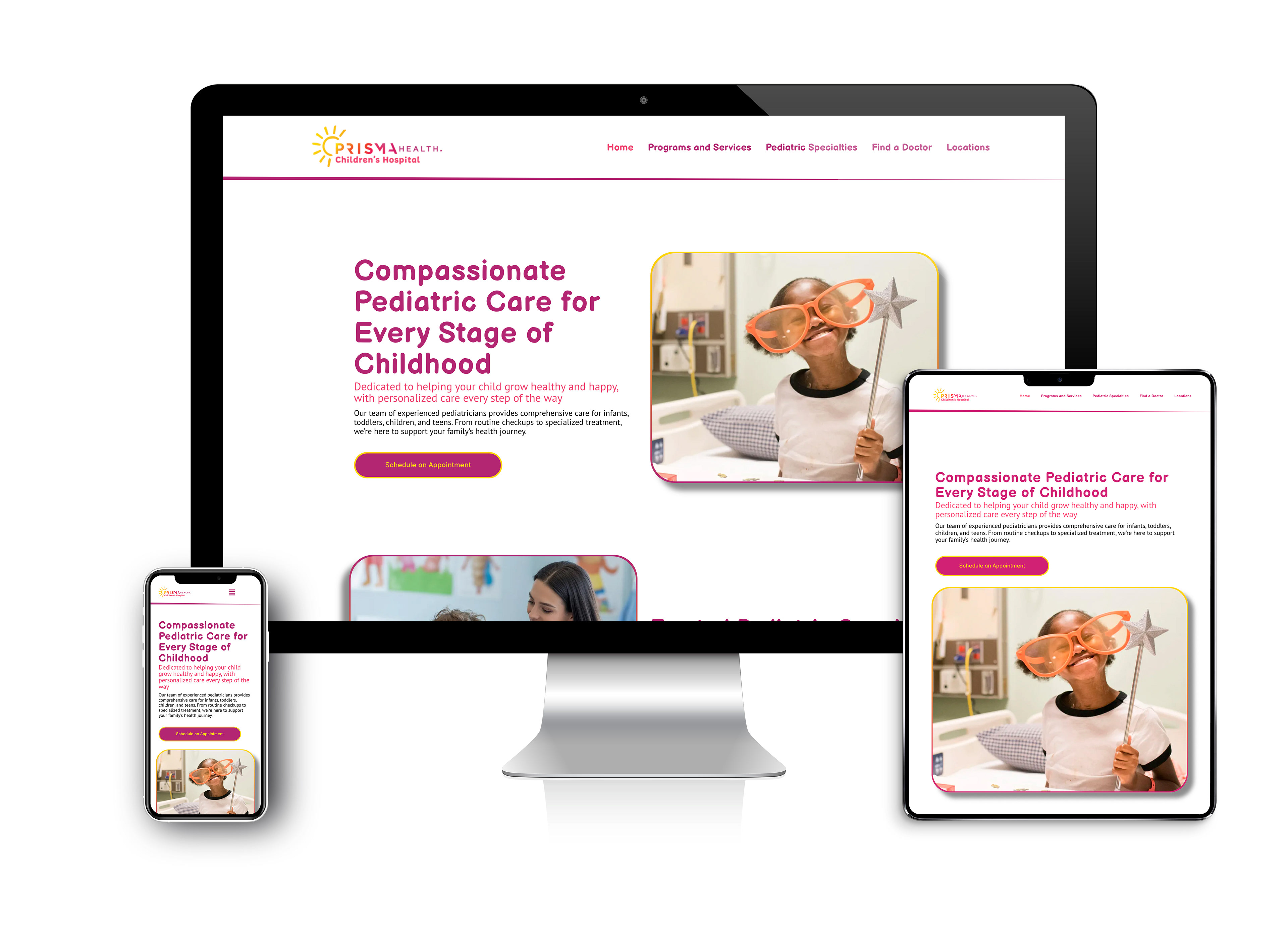
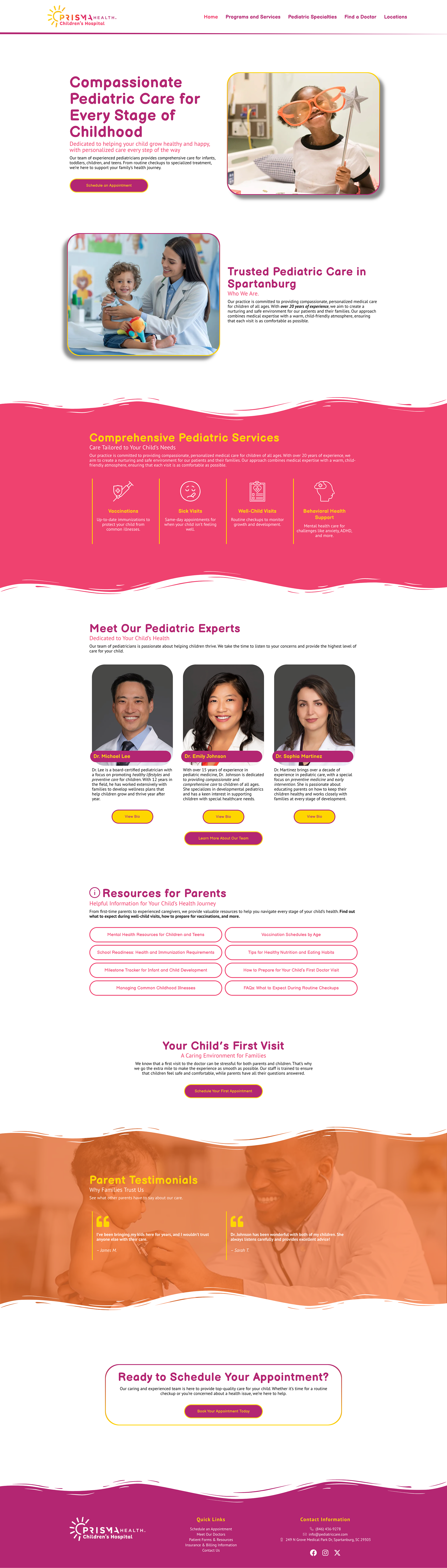
This project is a home/landing page concept for Prisma Health’s Children’s Hospital, designed to create a welcoming and reassuring digital experience for patients' families. The visual approach uses Prisma Health’s established brand colors to build a sense of trust and consistency, while softening the overall tone to feel approachable, calm, and family-friendly.
The layout emphasizes simplicity and clarity, guiding users quickly to essential information such as services and patient resources. Clean typography, intuitive navigation, and balanced spacing help reduce cognitive load, making the experience easy to navigate. The design is fully responsive, ensuring seamless functionality across smaller screens. Content is structured to adapt fluidly, maintaining readability and hierarchy on mobile devices without sacrificing usability.