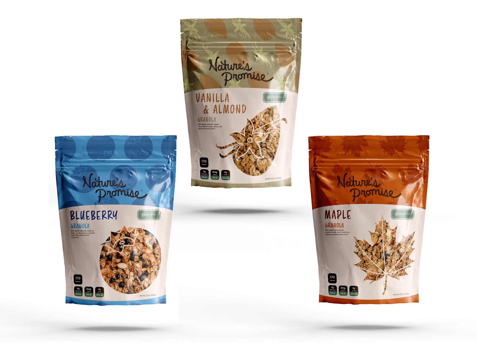
This project is a packaging redesign for Nature’s Promise Granola, focused on refreshing the product’s visual identity with a more modern and simplified approach. The goal was to create a clean, contemporary look that would stand out on the shelf while maintaining a sense of natural quality and approachability associated with the brand.
The redesigned packaging features a minimal layout paired with a bold, eye-catching pattern at the top of each bag. These patterns act as a key differentiator between flavors, allowing for quick recognition while adding visual interest to the otherwise streamlined design. The system was applied across three flavors—Almond & Vanilla, Blueberry, and Maple—each distinguished by its own unique pattern while remaining cohesive within the overall brand family.
Typography and composition were kept intentionally simple to enhance readability and emphasize the product itself. The balance between minimal structure and expressive patterning creates a packaging solution that is both functional and visually engaging, elevating the brand’s presence while clearly communicating flavor variety.