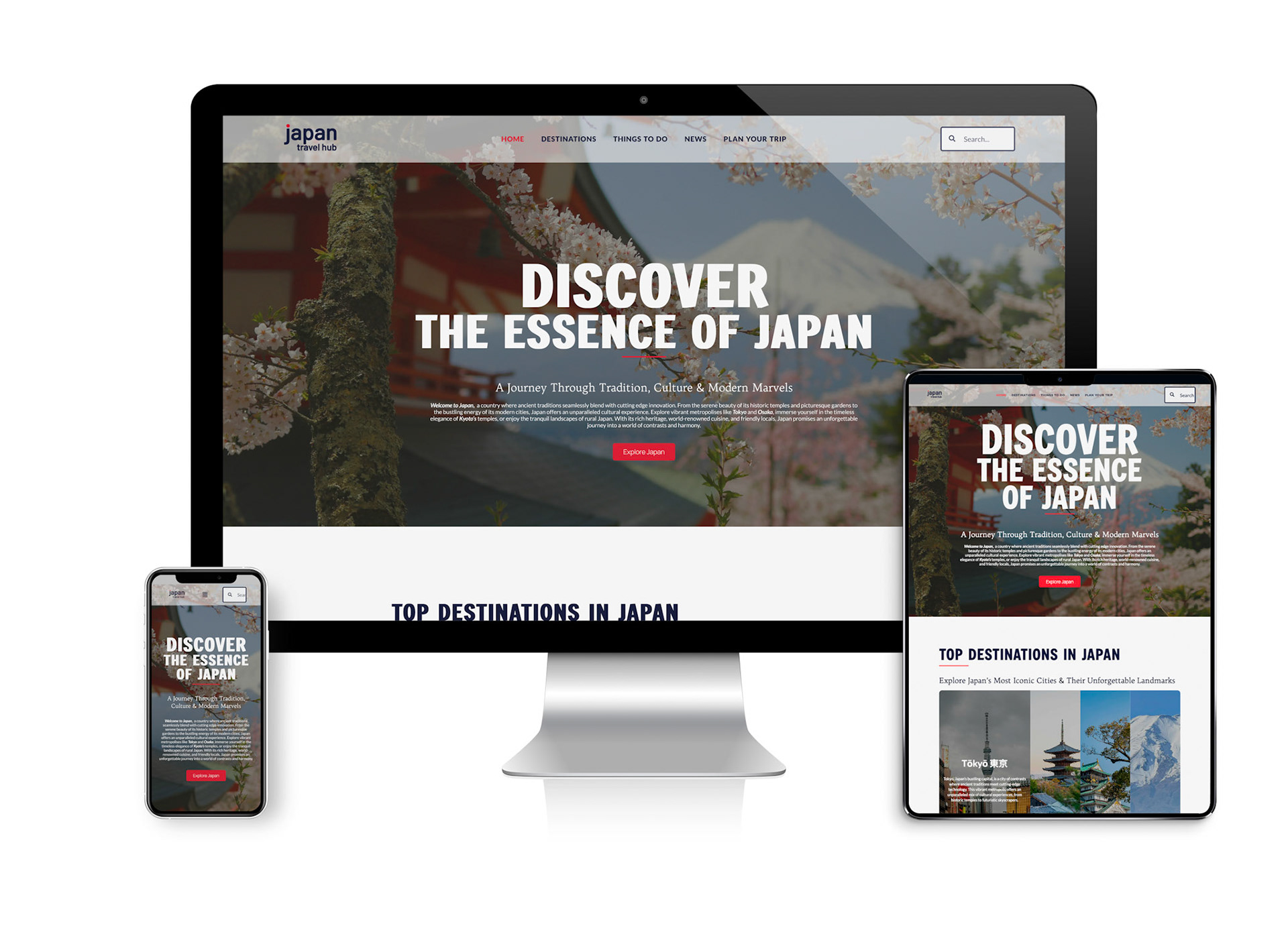
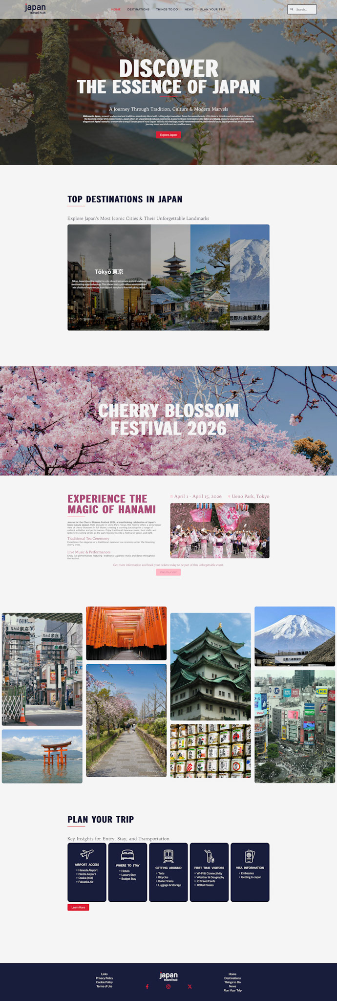
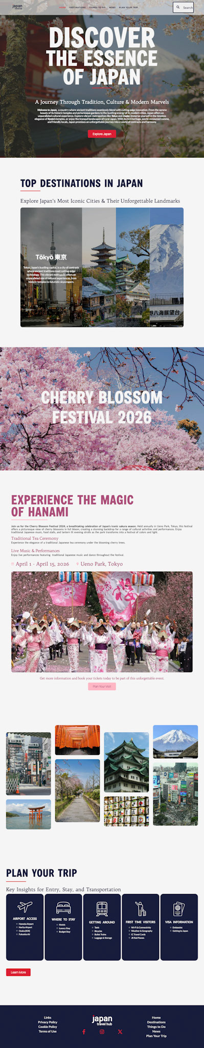
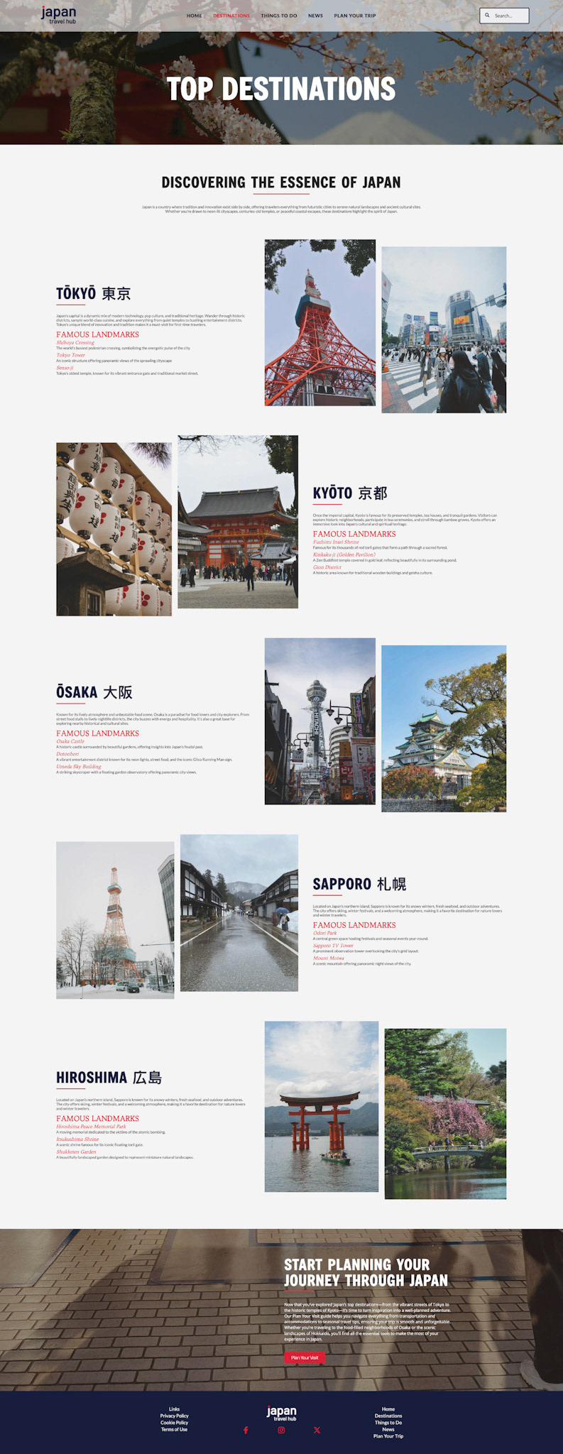
This project is a two-page, responsive travel website focused on exploring Japan, designed to balance modern usability with visual elements inspired by the country’s culture. The color palette centers on deep navy blue and vibrant red, referencing traditional Japanese aesthetics while creating a bold, cohesive visual identity. These colors are used strategically throughout the interface to highlight navigation, calls to action, and key content areas.
The layout follows a clean, modern design approach, prioritizing simplicity and clarity. Structured grids, ample spacing, and streamlined typography guide users through destinations, highlighted events, and travel resources without overwhelming the experience. Special attention was given to responsive design, ensuring the website functions seamlessly across smaller screens. Navigation remains accessible, and visual hierarchy is preserved, resulting in an engaging and user-friendly experience on both desktop and mobile devices.